First Sanofi, GSK, and now Johnson & Johnson are all undergoing significant rebranding efforts in the pharmaceutical industry. In a move to streamline their branding across business units, J&J is planning to shed the Janssen name for its pharmaceutical and R&D sectors, as well as its medical technology division. This shift is part of their strategy for the “next chapter” in their corporate narrative.
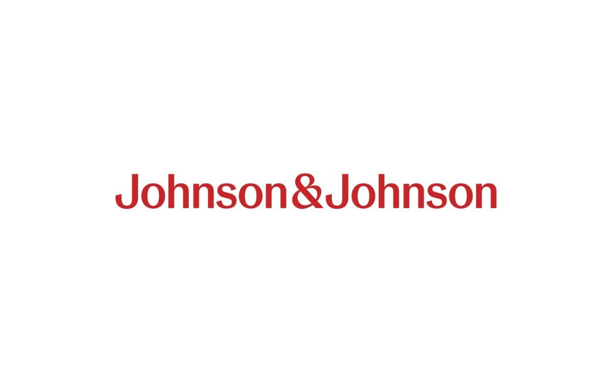
Accompanying this name change is a transformation of J&J’s iconic logo and branding style. The familiar calligraphic Johnson & Johnson logo is being replaced by a more contemporary, blocky font that resonates with the tech industry’s aesthetics. This redesigned logo symbolizes J&J’s modernization and is created in a single pen stroke for a sense of “unexpectedness and humanity.”
J&J is emphasizing both long and short-form versions of the logo, with a focus on the abbreviated ‘J&J’ for a more personable and contemporary appearance, particularly in digital interfaces. While retaining its signature red color, J&J is embracing a refreshed and bright color scheme that reflects its ability to respond promptly to health challenges and adapt to changing times.
“Our exclusive focus on Innovative Medicine and MedTech solutions enables us to innovate across the full spectrum of healthcare in ways no other company can. Uniting our diverse businesses under an updated Johnson & Johnson brand reflects our unique ability to reimagine healthcare through transformative innovation, while staying true to Our Credo values and the level of care that patients and doctors expect of us.”
– Joaquin Duato, Chairman of the Board and Chief Executive Officer
The ampersand in the new logo, though somewhat old-fashioned, is enlarged and designed to convey a sense of caring and humanity. J&J states that it represents the openness of the brand and its purposeful connections, although the specifics of how this is achieved remain undisclosed. Additionally, a new corporate art direction has been introduced to inspire energy, optimism, and inclusivity in the healthcare sector, though detailed information on its implementation is not provided.
These rebranding efforts bear similarities to those carried out by Sanofi and GSK in the past year. Sanofi consolidated its brands, including Sanofi Pasteur and Genzyme, under the Sanofi name, accompanied by a more tech-inspired logo. GSK adopted the name GSK and modified its logo, emphasizing a bolder and darker orange color scheme.
These rebranding endeavors in the pharmaceutical industry reflect a broader trend of companies repositioning themselves to meet evolving market demands while conveying a more contemporary image to their stakeholders.